Can one bullish accent in gold's performance change the medium-term outlook?
Gold was unchanged yesterday, and the GDXJ moved lower by 0.6%. Today’s pre-market action is very far from being confirmed. This means that what I wrote about the context (and outlook) yesterday remains up-to-date:
Yes! The breakout above the $1,900 and 61.8% Fibonacci retracement levels in gold was confirmed, which is bullish.
Yup, that’s a fact, and there’s no denying it. However, does this single bullish fact change the outlook? I don’t think so. Here are a few major reasons why.
The most important one comes from gold’s very long-term chart.

I wrote about the key long-term fact a week ago:
Do you know what levels gold has recently reached? Hint: those are very, very, very important price levels…
Gold just once again reached its 2011 high. The one that triggered reversals either immediately or after an additional rally (but it took a war outbreak in Europe to push gold temporarily (!) above this level). Therefore, the importance of this long-term resistance can’t be overstated.
That’s one thing. Another thing is that, given the major fundamental event that I already mentioned above (the war outbreak), it’s possible for the technical patterns to be prolonged and perhaps even repeated before the key consequence materialized. Similarly to the head-and-shoulders pattern that can have more than one right head before the breakdown and slide happen.
In gold’s case, this could mean that due to the post-invasion top, the entire 2011-2013-like pattern got two major highs instead of one. And thus, the initial decline and the subsequent correction are pretty much a repeat of what we saw in 2020 and early 2021, as well as what we saw in 2011 and 2012.
The particularly interesting fact (!) about the correction that we saw after the 2011-2012 decline (the one that was followed by the huge 2012-2013 decline) is that during it, gold corrected slightly more than 61.8% of the preceding medium-term decline. Consequently, the current situation is just like what happened back then.
And if all the above wasn’t bearish enough, please take a look at the reading of the RSI indicator based on the weekly price changes. It’s now just below 70, and guess where it was at the final top before the 2012-2013 slide? Yes, it was exactly there, too.
That’s also approximately where the RSI was at last year’s top.
Taking all the above into account clarifies that despite Friday’s and the last few weeks rallies, the medium-term outlook remains very bearish. Of course, that’s just my opinion, and please feel free to do with your capital what you see fit, but I’m keeping my money where my mouth is and I’m keeping my short position in junior mining stocks intact. All of last year’s trades were profitable, and, while I can’t promise any kind of performance, in my opinion the current one will become profitable (very profitable, actually) as well.
Since gold moved up by just $6.50 last week, the entire above quote remains up-to-date, and so do its bearish implications.
There’s also one more very important resistance level that gold reached that you already saw but that I didn’t write about. It’s clearly visible on the chart from the “Upcoming…” section that I’m posting in each Gold Trading Alert.

Namely, gold moved to its rising resistance line based on the initial two bottoms of the rally. The important thing about this line is that it has already worked twice: once as support in early 2022 and then as resistance shortly thereafter. It’s now working as resistance once again.
So, these are two important long-term-based bearish indications, and one of them sheds extra light on gold’s move above the 61.8% Fibonacci retracement, pretty much nullifying its bullishness.
Let’s keep in mind that the bearish (for gold!) implications of the USD Index’s death cross remain in place.
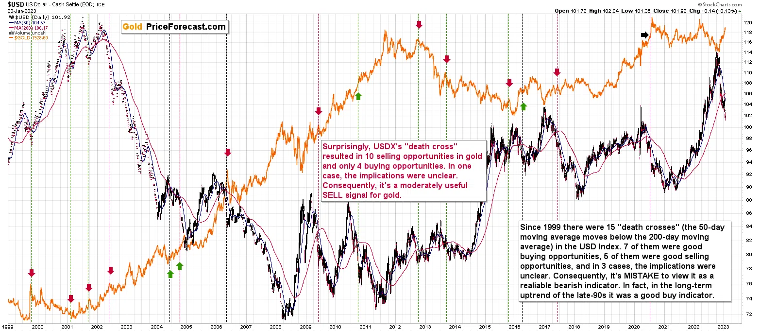
As a reminder, the “death cross” is a technical phenomenon that takes place when the 50-day moving average moves below the 200-day moving average. That happened recently in the case of the USD Index. This is an indication with a scary name that journalists often pick up on. “Journalists” and not “analysts,” and this means that it’s imperative to check if this technique really worked before taking any action based on it.
The above chart proves that over the past 24 years there have been no reliable indications for the USD Index based on the “death cross.”
The red vertical dashed lines mean that a given “death cross” was a good selling opportunity.
The green vertical dashed lines mean that a given “death cross” was a good buying opportunity.
The black vertical dashed lines mean that a given “death cross” isn’t a particularly useful indication.
7 of the “scary death crosses” were actually good buying opportunities; 5 were selling opportunities, and 3 had no major implications. Consequently, this is not a reliable signal for the USDX at all. If forced to choose a side, it would have slightly more bullish implications than bearish ones.
Always, always, always check if something works before applying it to practice, especially when it has a fancy name.
Interestingly. The implications for the gold market were much more reliable, and I marked them with arrows.
The red arrows mark good selling opportunities in gold in the case of the USD Index’s “death cross.”
The green arrows mark good selling opportunities in gold in the case of the USD Index’s “death cross.”
The black arrows mark unclear situations in gold in the case of the USD Index’s “death cross.”
In this case, we had 10 selling opportunities and just 4 buying opportunities. It’s far from 100% efficiency, but it’s decently bearish for gold, to say the least.
All in all, the current outlook remains bearish for gold and the rest of the precious metal sector for the following weeks and months.
Personal Note
On a personal note, I would like to apologize for not being more active in the comments feed below articles lately. The reply to all questions that effectively mean “do you still think that junior miners are going to decline significantly?” is “ yes, I continue to think so, and you’re reading daily updates on that in the Gold Trading Alerts – I will say exactly the same thing in the analysis, in the comment feed, over the phone, in the video, and in person :).”
The transition from Sunshine Profits to Golden Meadow is underway, and since the shift is much bigger than what you saw so far, it requires quite a substantial amount of planning and leadership. Since about 1/3 of the plans are still mostly inside my head, I’m still required to participate personally, even though my brilliant directors take care of most things.
I’m also relocating to a different apartment, and it takes quite a lot of time to review them and pick something great (you don’t want echo in my videos, while I’m recording from my home office, right?).
I’m also engaged in a public speaking course, which ends in late March. On top of that, on Friday, I started… studying at Stanford University. You will find more about the Applied Compassion Training that I just joined over here: https://www.appliedcompassionacademy.com (scroll down that page for a familiar face). I’m the first person with the Chartered Financial Analyst designation to ever join the program. For my Capstone Project, which I’ll be realizing throughout the year, I plan to create a special course for Golden Meadow that helps to facilitate connections (authors-investors and investors-investors) and conversations and make them even more based on common goals, growth, and compassion than is the case right now. So, yes, I really do want to transform the way investment newsletters and investment education work.
Przemyslaw K. Radomski, CFA
Founder, Editor-in-chief